Back to home
Brand and app for a volunteer management system.
Introduction
Voluntarius matches people to local volunteer shifts: blood drives, food bank sorting, shelter walks. The product worked and the sign-up did not. Getting someone started took a walkthrough and a phone call every time, which quietly caps how many volunteers an organisation can take on. We built the identity and rebuilt the app around the first ten minutes.
Client
Voluntarius
Industry
Volunteer management, nonprofit
Scope
Brand identity, product design
Year
2024
Duration
6 weeks
The problem
Everything a coordinator might ever need appeared on the first screen a volunteer saw. So the first screen taught nothing and asked for everything. People signed up, could not tell which shifts were actually open to them, and went back to asking a coordinator directly.
That works at twenty volunteers. It is the reason an organisation stalls somewhere under a hundred.
The approach
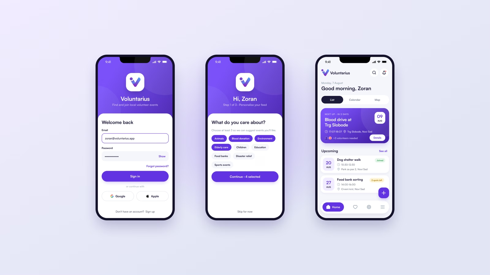
Ask what someone cares about before asking anything else. Sign-in is followed by one question: pick at least three causes. Animals, blood donation, elderly care, food banks. It takes seconds, it is the only thing standing between a new volunteer and a feed worth reading, and it is the input the matching runs on.
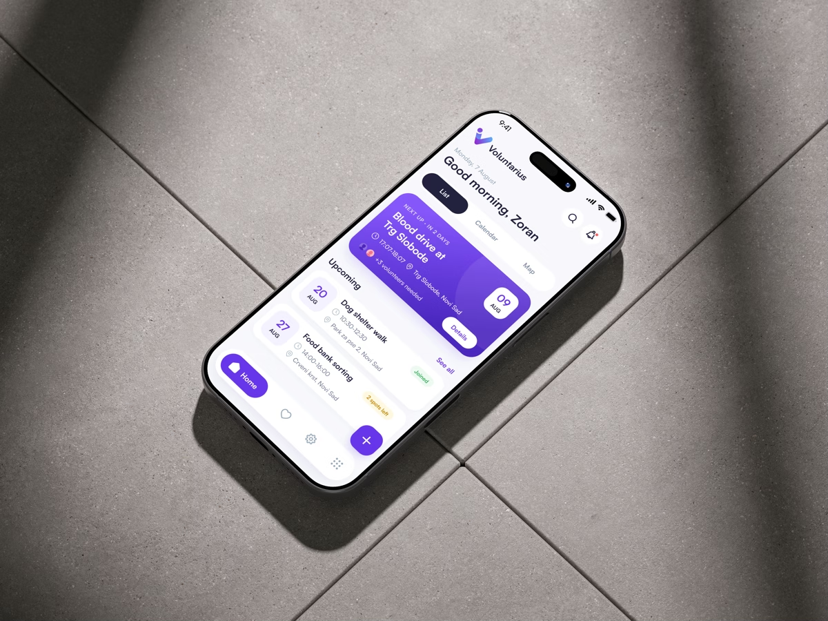
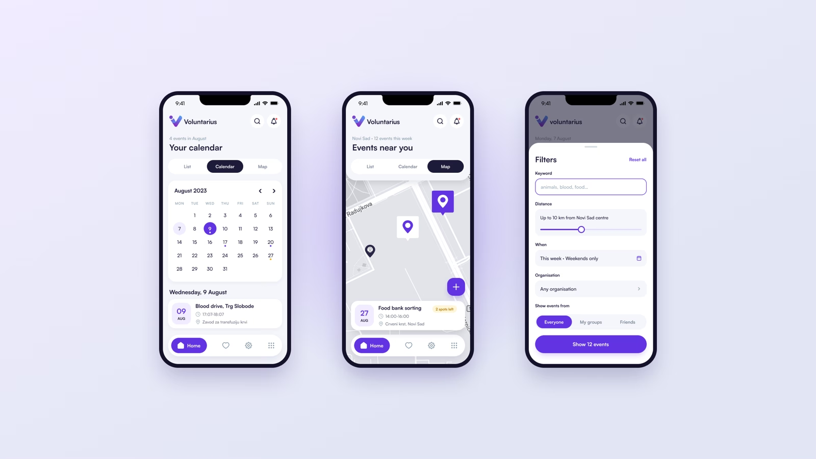
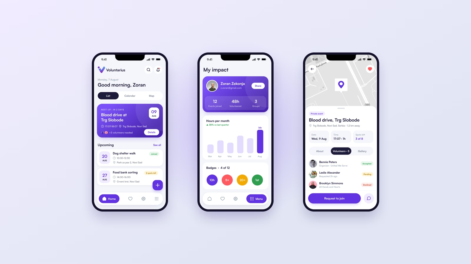
From there the home screen leads with the next shift and the date, then everything upcoming. List, calendar and map are the same data, so nobody has to learn a second model to find a Saturday morning.
The identity carries the same logic. The V is also a check mark, built in a violet-to-blue gradient that reads at app-icon size and holds up on the dark surfaces the app uses behind every header.
The outcome
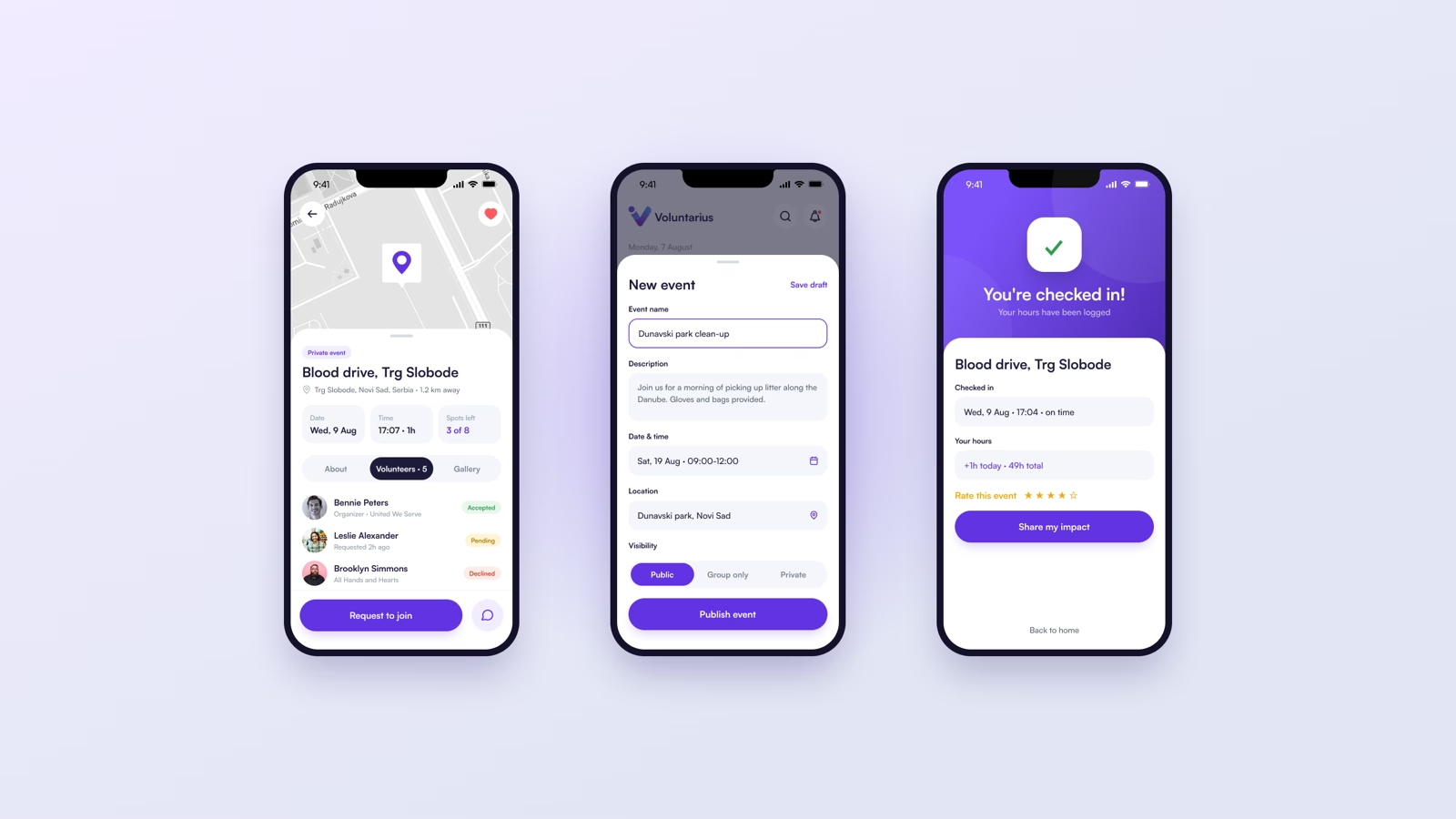
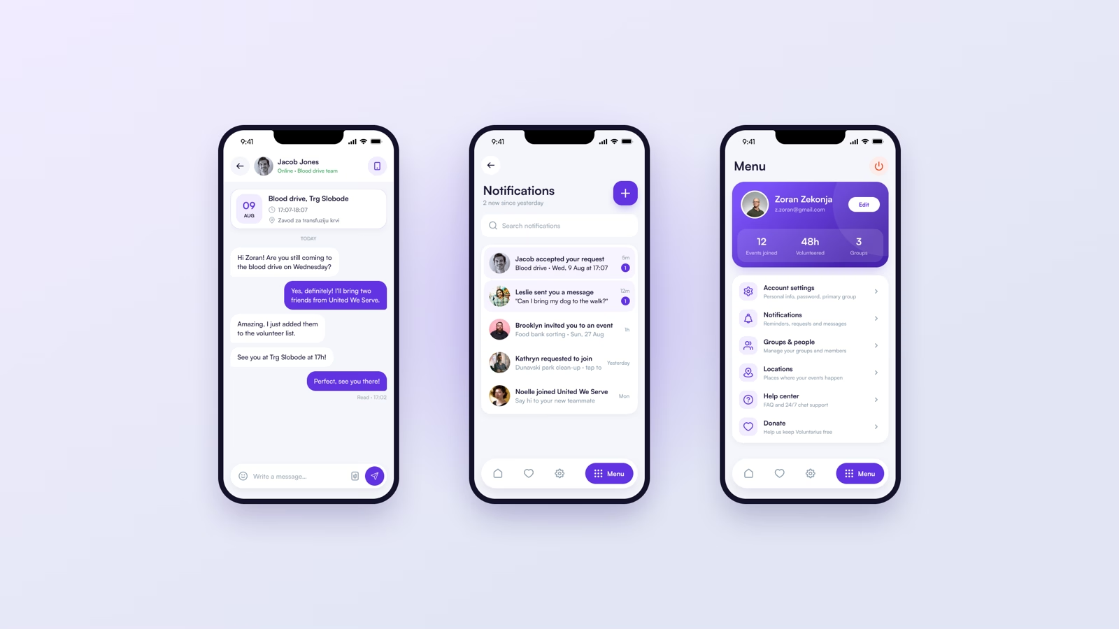
Onboarding stopped needing a person. A volunteer gets from invitation to a confirmed first shift on their own, and the states say so plainly: joined, waitlisted, spots left, full.
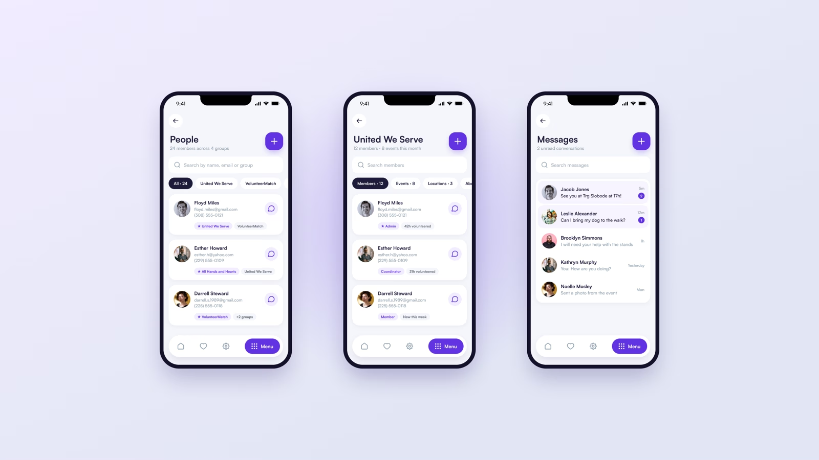
Coordinators kept their tooling, moved into a view of its own instead of spread across the screens everyone else uses.