Back to home
Brand and website for Tessaro, the team behind Weft.
Introduction
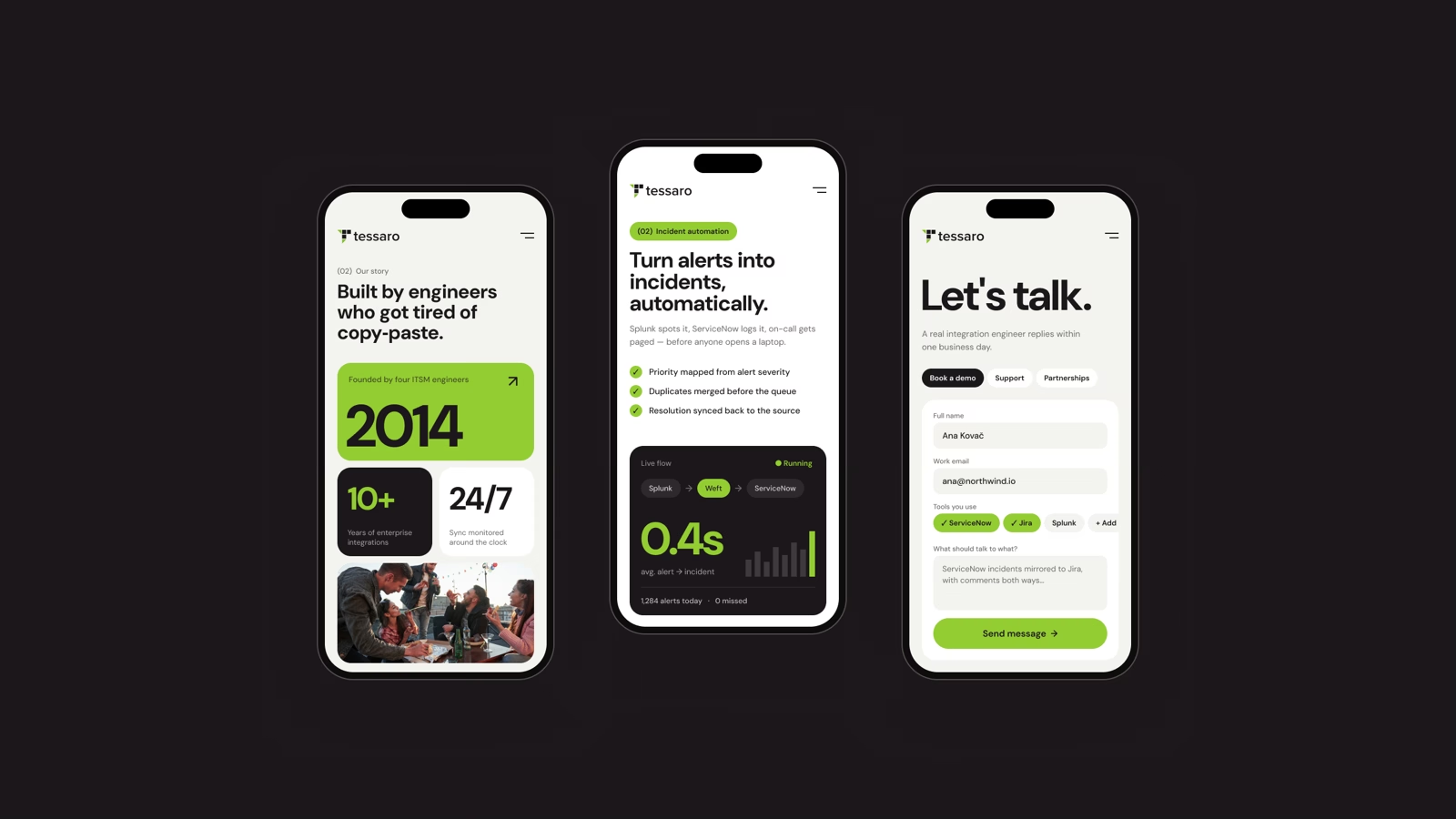
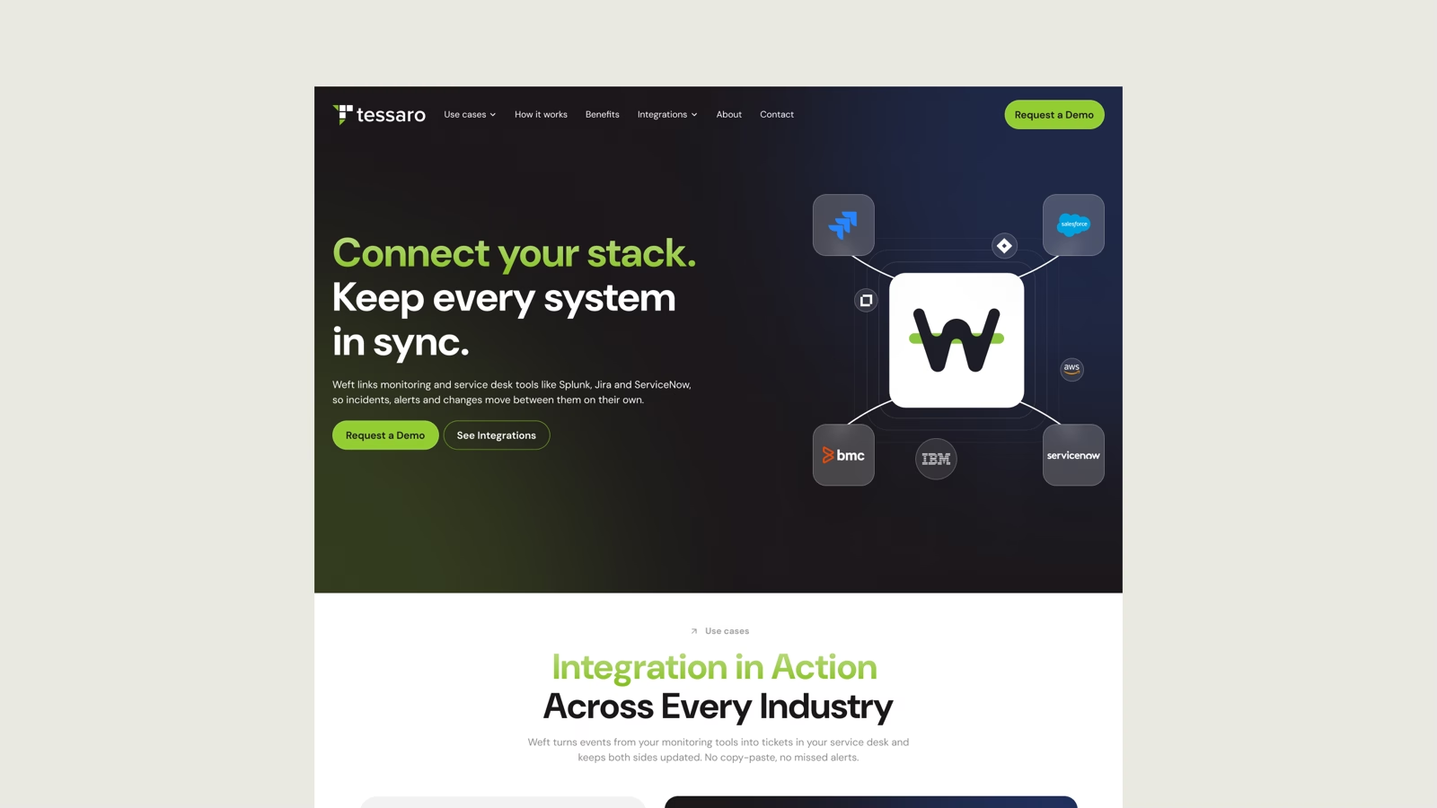
Tessaro builds Weft, the quiet layer that keeps a service desk, its monitoring tools and the business systems around them in sync. Plumbing like that is invisible when it works, which makes it hard to sell. The identity gives the invisible part a shape, and the site shows a buyer their own stack inside it before anyone asks for a demo.
Client
Tessaro
Industry
Enterprise software, ITSM
Scope
Brand identity, website
Year
2026
Duration
2 months
The problem
Integration middleware is invisible when it works, which is exactly what makes it hard to sell. Tessaro had spent a decade building Weft for enterprise IT teams, but everything they put in front of a buyer looked like every other connector vendor: the same abstract network diagram, the same promise about breaking down silos.
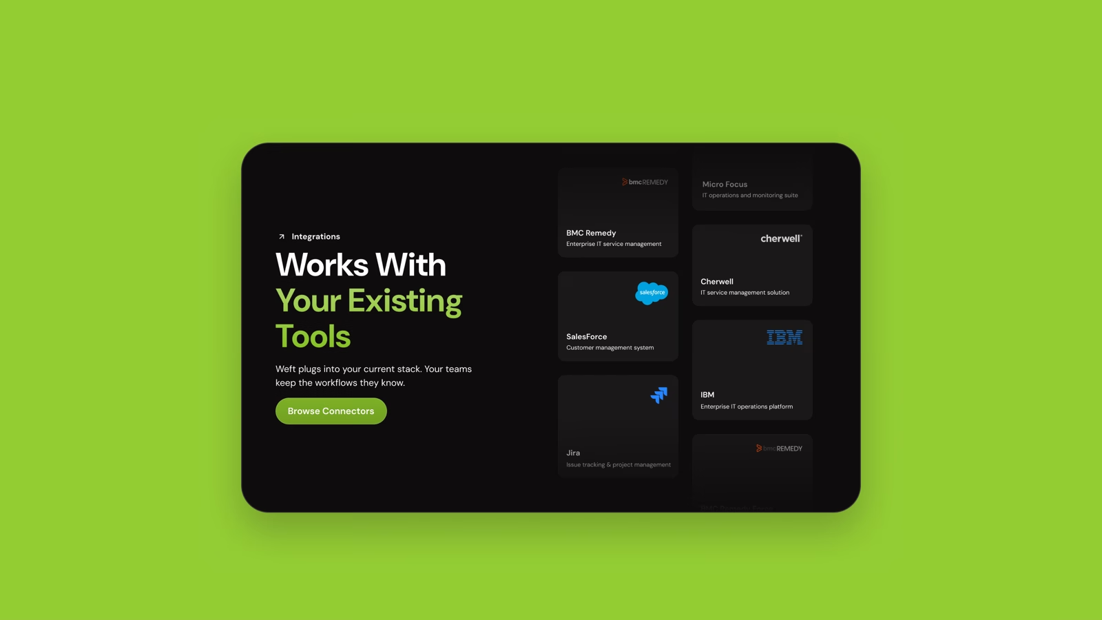
The people who sign off on this are ITSM leads. They do not want a metaphor. They want to know whether it speaks to the ServiceNow instance and the Splunk alerts they already run.
The approach
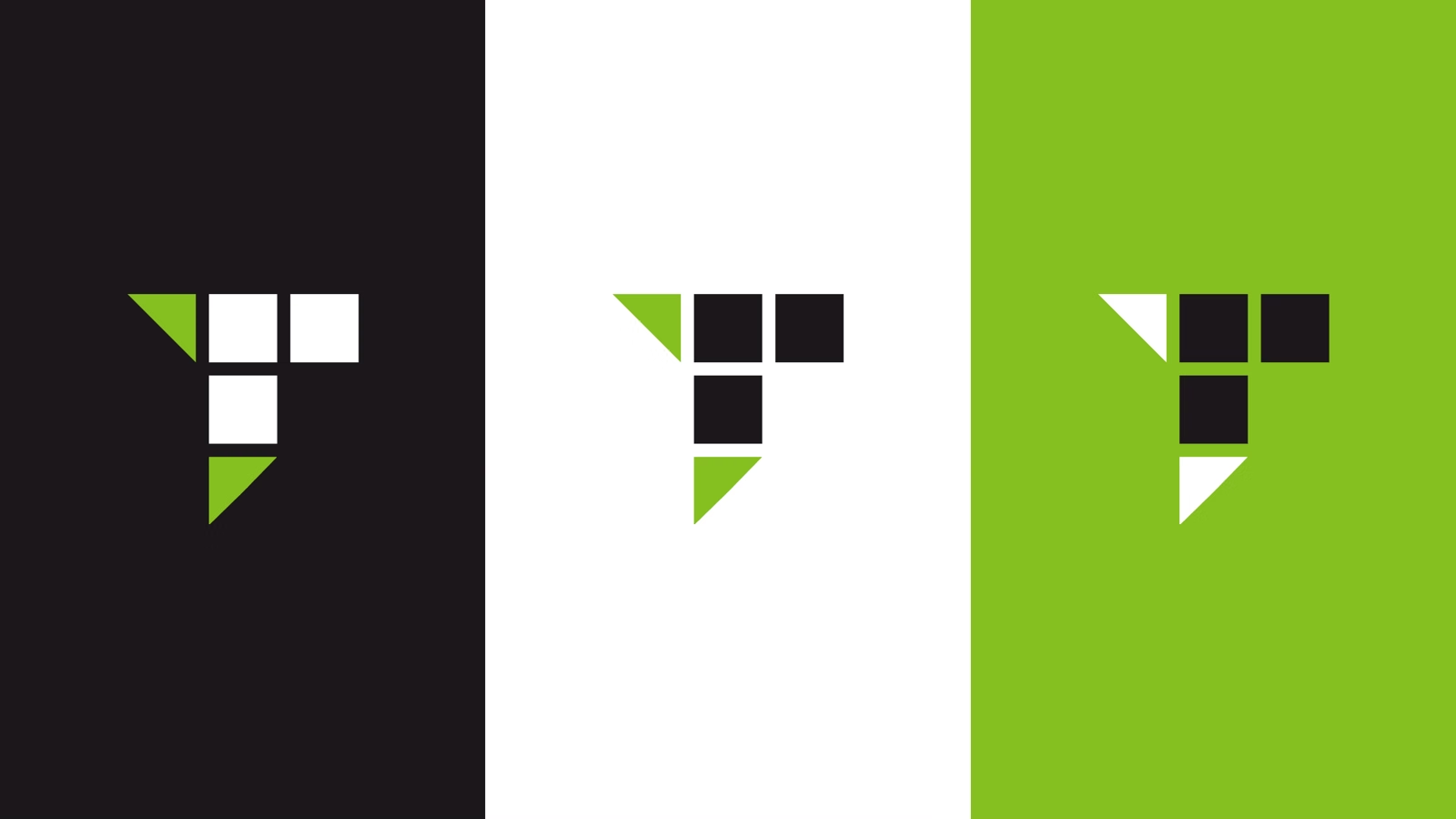
The name was already the idea. A tessera is the single tile a mosaic is built from, and a weft is the thread that crosses the warp to hold a weave together. The mark is one tile, cut on the diagonal where the weave changes direction, resolving into a T that still reads at favicon size.
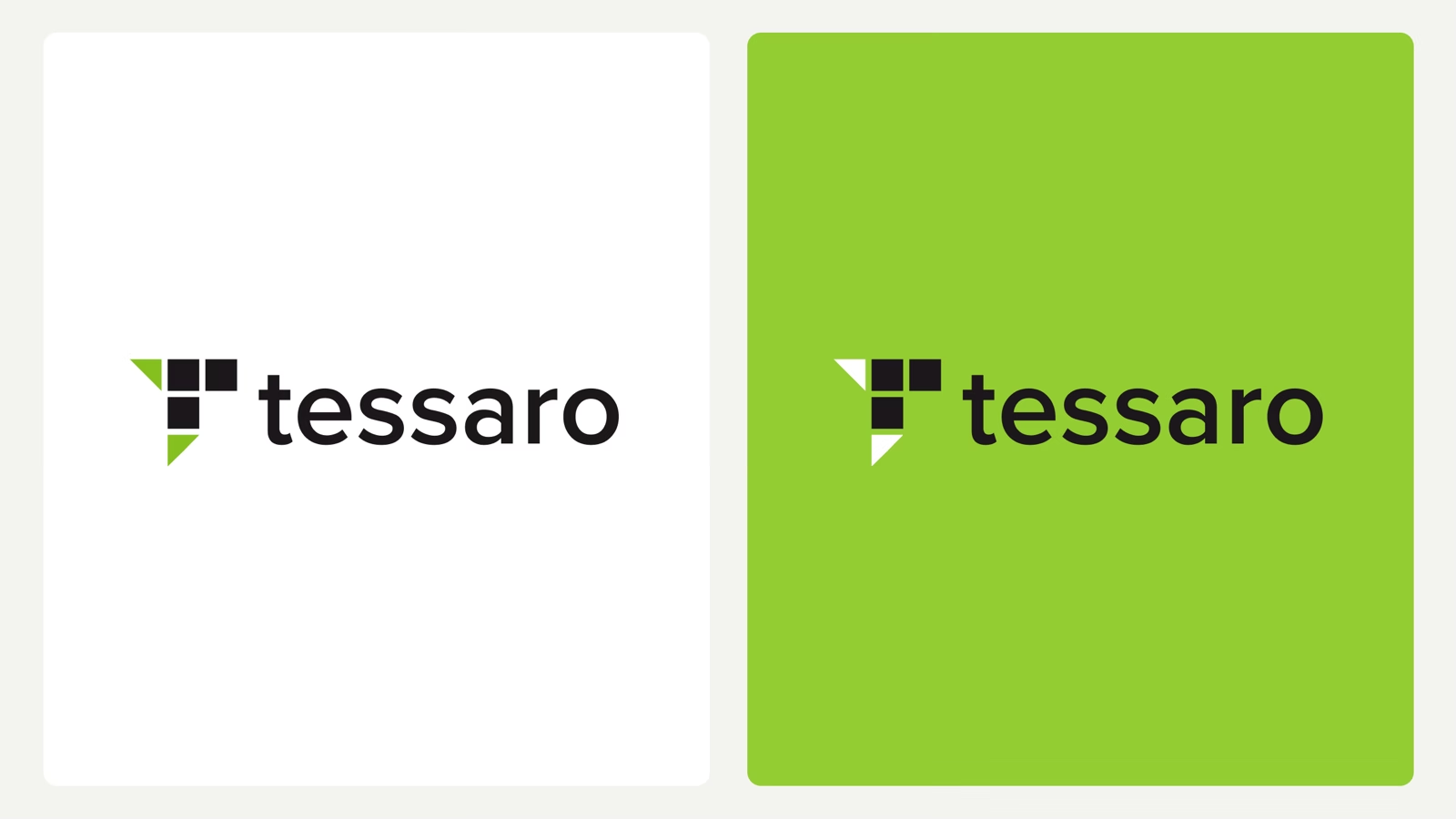
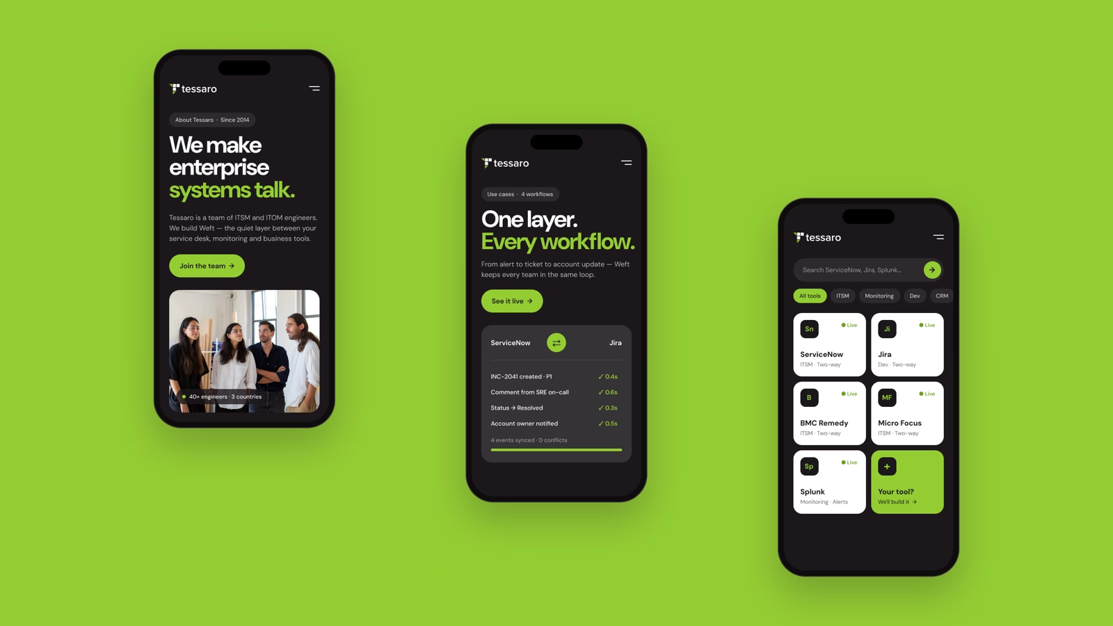
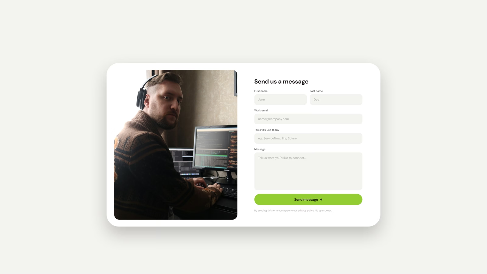
The system stays deliberately narrow: lime against near-black ink, white kept for cards, DM Sans throughout. On the site, every abstract claim had to be followed by something specific, so the integrations page names the tools rather than describing them, and the contact form asks which stack the visitor runs today.
The outcome
One identity that holds from a favicon to a trade-show wall, and a site a buyer can qualify themselves on. The mark works in a single colour, reversed out of lime, and at sizes where the tile grid collapses into a solid letterform. Logo, type scale, colour and the component set shipped together as one file the team builds against.
The marketing site runs the same system end to end, desktop and mobile, with a connector page that does the first half of a sales call before anyone books one.